Page 1 of 2 12 LastLast
Results 1 to 15 of 17

Thread: Eating Habits Poster.

  1. #1
    Just been bitten Fulcifan91's Avatar
    Member

    Join Date
    Jun 2006
    Location
    Maryland
    Posts
    241
    Undisclosed

    Eating Habits Poster.

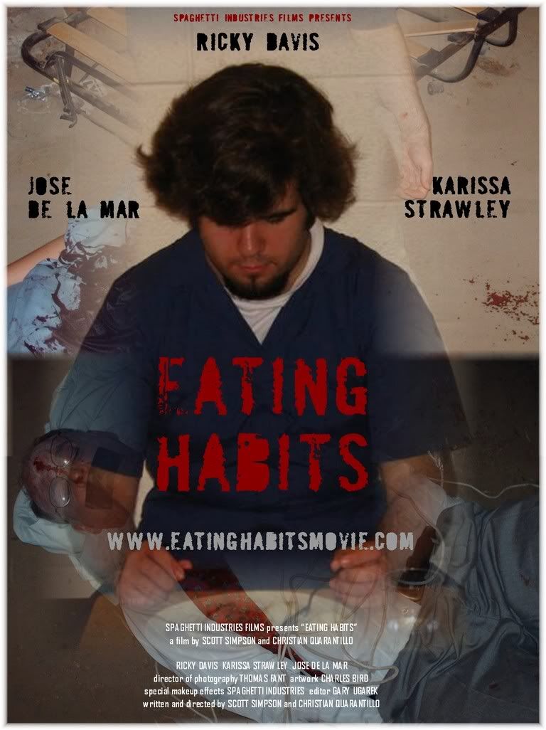
    A little less boring then the prior one. Let me know what you think, or tell me if you think you can make a better one


  2. #2
    Feeding LouCipherr's Avatar
    Member

    Join Date
    Feb 2006
    Location
    Hell
    Posts
    4,029
    United States
    That poster is much better than your previous one - I think it's a keeper!! Great work guys.

    LC

  3. #3
    Banned zombiegirl's Avatar
    Banned User

    Join Date
    Jun 2006
    Location
    far side of hell
    Age
    49
    Posts
    341
    United States
    I really like this poster Fulci. I think you did a great job.

  4. #4
    Just been bitten Fulcifan91's Avatar
    Member

    Join Date
    Jun 2006
    Location
    Maryland
    Posts
    241
    Undisclosed
    Thank you. Everyone likes this one better, even me.


  5. #5
    certified super rad Danny's Avatar
    Zombie Flesh Eater

    Join Date
    Mar 2006
    Location
    simply walking into mordor
    Age
    36
    Posts
    14,157
    UK
    its good but it doesnt really give a viewer a feel of the movie ,and remember most people are dumb as hell so you gotta spell it out like red is bad blue is good and all that. i think it might need darkening a bit but not bad.


  6. #6
    Just been bitten Fulcifan91's Avatar
    Member

    Join Date
    Jun 2006
    Location
    Maryland
    Posts
    241
    Undisclosed
    What do you suggest getting on there?

    Its about Maddox Washington, a Cannibalistic serial killer, and ideas?

    Thanks for the suggestion too, it is to easy to assume thing when your working on the moive yourself, you already know everything so you dont know if the audio is good because you know the lines anways, and things like that.

    Also, my computer is very dark, and i cant get teh monitor to brioghten up, like most green colors looks almost black on here. i have everything set to the brightest, so that is proabbly why it is the right darkness for me, but bright when it shows up on everyone else's pc.


  7. #7
    Being Attacked EvilBread's Avatar
    Member

    Join Date
    Jun 2006
    Location
    High Wycombe
    Age
    40
    Posts
    51
    UK
    Perhaps you could use just one shot which is simple but effective?

    Do you know anyone who does photography who would be able to take some real moody shots? Maybe a shot of a proper home cooked meal with vegetables on it etc, but in the middle sits a bloodied beating human heart?

    The poster you have now is rather cool, but seems a little cluttered. Simplicity is the key I have found.
    Sound is more important than picture.

    Get the money on the screen

  8. #8
    Banned zombiegirl's Avatar
    Banned User

    Join Date
    Jun 2006
    Location
    far side of hell
    Age
    49
    Posts
    341
    United States
    Fulci I like the poster just the way it is. One of the things I like about it is that you can see different aspects of your movie around your main character. I also love the way it blends togother. Great Job!

  9. #9
    Just been bitten Fulcifan91's Avatar
    Member

    Join Date
    Jun 2006
    Location
    Maryland
    Posts
    241
    Undisclosed
    Thank you all. I think the heart is cool, but maybe a bit too cheesy, i want the focus to be on him

    maybe itd better express the cannibal part by showing the top picture a little better.

    here is what it looks like un-covered:


  10. #10
    Feeding LouCipherr's Avatar
    Member

    Join Date
    Feb 2006
    Location
    Hell
    Posts
    4,029
    United States
    mmmmm.. eyeballs. They're not just for breakfast anymore.

  11. #11
    pissing in your Kool-Aid DjfunkmasterG's Avatar
    Zombie Flesh Eater

    Join Date
    Feb 2006
    Location
    Deadlands, USA
    Age
    52
    Posts
    7,663
    United States
    You should make a huge Dinner platter filled with Eyeballs, toes, fingers, a heart, some lips, and a tongue... Photograph it, and make your poster out of that.

    Use LOU's tagline.!
    ALWAYS BET ON DEAD!
    Official member of the "ZOMBIE MAN" Fan Club Est. 2007 *FOUNDING MEMBER*

  12. #12
    Just been bitten Fulcifan91's Avatar
    Member

    Join Date
    Jun 2006
    Location
    Maryland
    Posts
    241
    Undisclosed
    Hahaha.

    Ive recently been talking to a friend Shawn, who owns and operates Rotten Cotton, some of the best t-shirt on earth, and he said he will review the movie for us, plug it online, and even give us a quote on it for the poster and DVD box set.

    Great news for me, Shawn is considered a celebrity, although i know hes probably not to most of you.

    He does have alot of pull in the internet horror world, and he is one of the coolest guys i know.


  13. #13
    Being Attacked chukrok's Avatar
    Member

    Join Date
    Mar 2006
    Location
    Louisville, KY
    Posts
    60
    Undisclosed
    OK, I know you wanted the focus to be on him, but I had an idea (similar to what was being mentioned around here) since I read this thread a while back. It just took a while to actually create. I'll just run this up the flagpole and see if anyone salutes. The extra white space is for credits.

  14. #14
    certified super rad Danny's Avatar
    Zombie Flesh Eater

    Join Date
    Mar 2006
    Location
    simply walking into mordor
    Age
    36
    Posts
    14,157
    UK
    ooh ,classy!


  15. #15
    Being Attacked EvilBread's Avatar
    Member

    Join Date
    Jun 2006
    Location
    High Wycombe
    Age
    40
    Posts
    51
    UK
    Like a menu, I like it
    Sound is more important than picture.

    Get the money on the screen

Bookmarks

Posting Permissions

  • You may not post new threads
  • You may not post replies
  • You may not post attachments
  • You may not edit your posts
  •