Which is your favorite? |
|
|

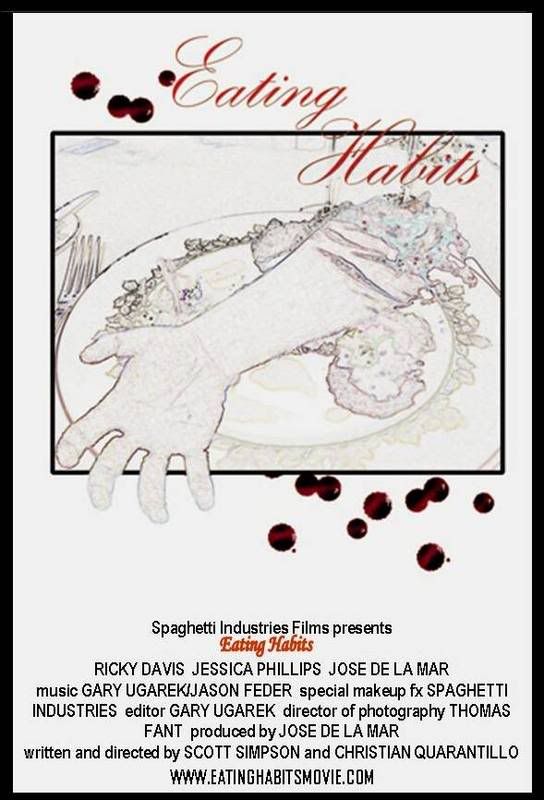
First
Second
Third
| Thread: Eating Habits Poster Vote |


Which is your favorite? |
Last edited by Fulcifan91; 22-Sep-2006 at 02:12 AM.


the 3rd is just way to busy, and much as i like it ive seen too many like the 1st before the 2nd kinda reminds me of the zombie honeymoon poster but i like it! |


I like the 2nd one. It kind of reminds me of a fancy restaurant menu, with a bit of chaos going on. I also like #1, but I voted for #2. |
ALWAYS BET ON DEAD!Official member of the "ZOMBIE MAN" Fan Club Est. 2007 *FOUNDING MEMBER*

I'm a fan of black & red ... so I picked one, it's simpler and more sinister. |
Ranting on HPOTD Since 1998
TWD Memes - Movie Reviews - HPOTD FAQ
"Celebrityville" - "Tigress of Celebrityville" - "How Mr Snuffles III and Others Met Their Maker" - "Dug Deep"
I agree with MZ - the first one is the one that really caught my eye too. I like all three, but if it were me and my movie, i'd pick #1. |
As a consumer the first one caught my eye...it made me wonder what that guy was doing and thinking? The other two are good I like the second one too. The third one has too much going on too busy! Anyway thats my vote! |
I agree with Minion, Lou & Debbie. # 1 is the way to go |
Yeah, the first one really seems much more 'mysterious' than the others and doesn't give away much. I likey - use #1! |
I chose number one.....but I really like the menu thing that's going on with number two. |
I voted #1, like I said earlier, but if you want to economise on ink then #2 is also good - just enhance and make clearer the title of the film, make the image clearer also and maybe choose a new font for the credits at the bottom. Just thought I'd add those ... er ... thoughts to this thread. |
Ranting on HPOTD Since 1998
TWD Memes - Movie Reviews - HPOTD FAQ
"Celebrityville" - "Tigress of Celebrityville" - "How Mr Snuffles III and Others Met Their Maker" - "Dug Deep"
 Posting Permissions


 Reply With Quote


Bookmarks